


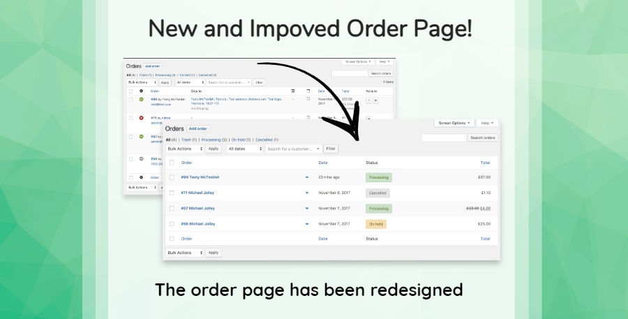
As part of our continuous commitment on delivering the best client experience and enabling the best technology for our clients, we’ve been working on adding some new features on the Client Orders Page and improving its overall appearance.
OLD ORDERS SCREEN
First let’s take a look at the previous order screen and point out some issues.
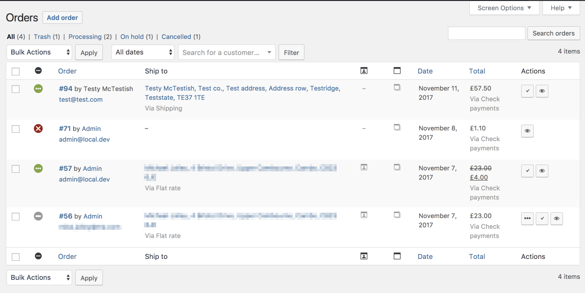
Problems:
- Status icons are only used on this screen, and have little meaning or context (colored icons on the left)
- Action icons are similarly confusing, largely due to the icons being open to interpretation unless the user hovers overs it and sees the respective note.
- Showing addresses here is of little benefit since you cannot fulfill orders without knowing whats inside.
- Other data that isn’t really needed here (because you cannot do anything with it) such as payment method, shipping method, columns for notes with nothing but an icon.
NEW ORDERS SCREEN
The new screen was redesigned from the ground up and aims to simplify these views, as well as do code cleanup behind the scenes. This is the re-factored screen:
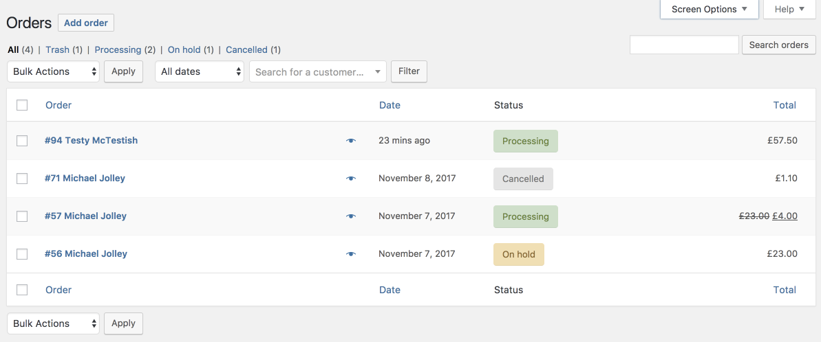
Key differences:
- Revised which columns are shown by default. Shipping address/billing address can still be toggled on, but are hidden by default.
- Combined order number/customer name into a single column with the most important data.
- Order Statuses are now color coded which makes them easier to spot
- Hidden the actions column unless an ecommerce addon uses it to add custom buttons. All previous order update actions are possible from the bulk actions drop-down.
- There is a new preview link for viewing order contents.
- Clicking any part of the row takes you to the main edit order screen.
- Statuses are text-based, and hovering the status reveals any important notes. Using words makes it clearer, especially for new users.
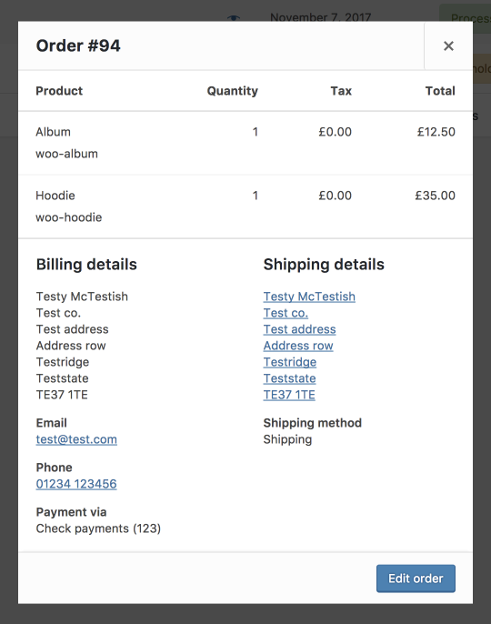
NEW PREVIEW POPUP
The new preview icon (eye) button was added which opens up a streamlined view of the order and all its relevant information at a glance.
By having all of this information on a popup modal we are able to show you more information about the order without having to click on “edit” order just to see the order details you need.
SUMMARY
- All orders are now easier to manage, especially for stores that receive a large number of orders per day.
- Store Manager can get a feel of what she needs to do just by looking at the color coded order statuses
- Store Manager can access all of the order’s information without accessing the full editing mode (this should save a lot of time)
We thank all of the customers that have submitted their feedback to us. We remind you that your feedback is not only very important to us but most of our client’s feedback gets materialized on product updates like this.
The Xtreme Websites Team
Like this Update or have Future Suggestions? – Let your voice be heard on the comments section.