Buttons are an essential tool for encouraging site visitors to take action. They can direct users to another page on your site, an external website, open a popup, contact form, online reservation, email address, and more.
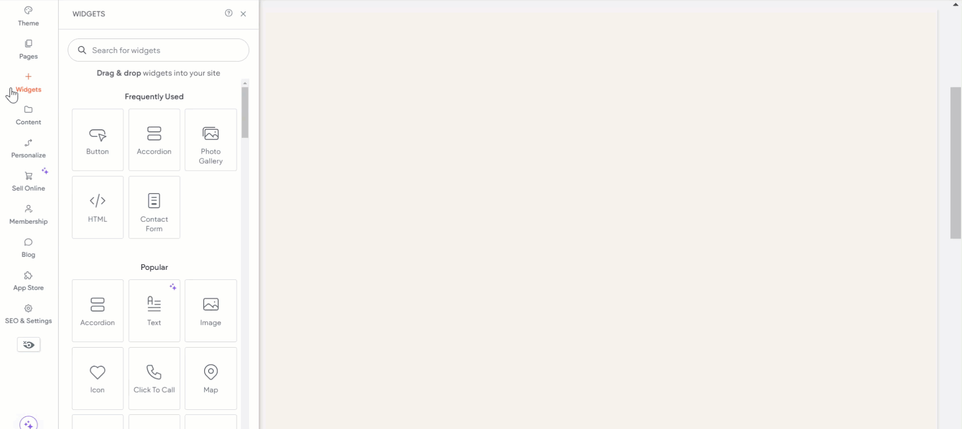
Adding Buttons #
- Access the Widgets Panel:
- Click on Widgets in the side panel.
- Add the Widget:
- Search for Button and drag it to your desired location on the canvas.
Content Editor #
To customize your button’s content:
- Accessing the Content Editor:
- Right-click the widget and select Edit Content.
- Customize Button Text:
- Enter the text you want displayed on the button.
- Link Options:
- Choose where the button links to:
- Existing Page
- Store link (visible if the site has a store)
- Website address
- Popup
- Anchor
- Back to top
- Membership plan checkout (visible if the Membership feature is enabled)
- Blog post (visible if the site has a blog)
- Email Address
- Click To Call
- File for download
Design Editor #
To refine your button’s design:
- Accessing the Design Editor:
- Right-click the element and select Edit Design
- Design Options:
- Choose whether the button inherits the primary or secondary button style from the theme panel.
- Customize the button layout, style (width, height), and text (font, size, color, format, alignment, and direction).
- Adjust inner and outer spacing.
Floating and Pinned Buttons #
Floating Buttons #
Floating buttons keep calls to action visible as visitors scroll. Ideal for contacts, subscriptions, or quotes.
- Enable Floating:
- In the side panel, click Widgets, find the Button widget, and drag it onto the canvas.
- Right-click the button, select Edit Design, and toggle the Floating option.
- Positioning:
- Select a position for the button, and adjust margins in the Spacing menu for device-specific placement.
- Enable Show on this page only to restrict visibility to the current page.
Note: Floating buttons appear on all pages by default.
Mobile Considerations #
- Placement: Position floating buttons at the screen’s bottom corner for easy access.
- Icon Use: Opt for an icon over text on mobile layouts.
- Visibility Issues: Update to a new mobile layout if buttons are not displaying.
Pinned Buttons #
Pinned buttons stay with their parent element in the viewport.
- Enable Pinned:
- In the side panel, find the Button widget, drag it onto the canvas, and open the design panel.
- Select Pinned in the Position type menu.
- Configure Offset:
- Set where the button pins during scroll. Adjust for sticky headers if needed.
A pinned indicator icon will appear in both the floating menu and design panel.
By utilizing button widgets effectively in Turnkey Websites™, you can create a dynamic and interactive user experience that encourages engagement and enriches site navigation.
What's your Reaction?
You have reacted on"Enhancing Site Interaction with Button Widgets"
A few seconds ago


 Subscriptions
 My Orders
 My Wishlist
 Refer & Earn💸
 My Projects
 Conversations
 Website Services
 New Website Request
 Website Addons
 eCommerce Addons
 eCommerce Modules
 Software Development
 Graphic Design
 Video Production
 Content Writing
 Marketing Services
 Marketing Products
 Get a Marketing Plan
 Local SEO Audit
 Sales Automation
 Service Automation
 Operations Automation
 Marketing Automation
 Payments Automation
 Premium Modules
 Support Tickets
 Latest Updates
 Consultation Calls
 Tools & Extensions
 Tech Tips & Tricks
 Domains & Emails